As a UX designer, I am in love with metrics this whole idea that we can just use data for anything and A/B tests is the best way to a great product. I think it’s just one of the worst aspects of the rise of this worship of data. Lots of teams think that quantitative data can solve all of their product problems.
Only 24% UX professionals are reported using quantitative AND qualitative data to determine success
NN Group “Quant Qual Research in Practice survey with 429 participants”
Quantitative data doesn’t replace designers or design or replace listening to the users and it doesn’t tell us what we should be building. It gives us another channel for getting feedback from the users, but the information that data gives us isn’t the same as what we’re getting from connecting with actual human beings who are using our product. It only gives us information about what we have built.
- Data doesn’t replace design or designers
- Data doesn’t replace listening to the users
- Data doesn’t tell us what we should be building
Quantitative data can help inform our design decisions, it doesn’t replace designer, but it gives us important feedback on the product decisions that we’ve made and understand whether our decisions helped or hurt user behaviour. Data can tell us whether we’re going in the right direction and it can also help us inform our research and tell us what we should be investigating.
Example:
We are going to use a checkout process funnel as our example, in this process users sign up for mobile plans. Everything you pour on top of the funnel comes out from the bottom that’s how funnels work. We are losing a certain percentage of the users who started right from the top and from each step users are dropping out. For every 100 users that are going through this funnel only 19 users are successfully getting through in other words you’re acquiring users through some means probably with google ads or getting customer referrals or any other expensive channels.
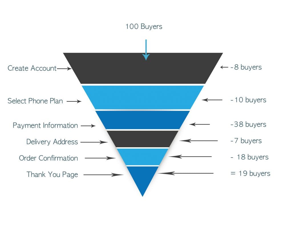
If you look at our checkout process, we are losing more users in some steps than others like specifically on payment information screen step looks poor, we are losing 38 users out of every 100, so that’s what we call a friction point. By looking at these numbers most of the teams immediately will start working on the ways of fixing the payment information screen. Some team members or stakeholders will suggest, “maybe we need to add new payment methods” or “may be it’s really confusing for user see the credit card type dropdown” or “maybe the user needs to feel secure and we should put a big lock on the page” or “may be we should try doing all of those things and then just see if a problem gets fixed”. Now at this point you should immediately stop thinking about solution. You are effectively trying to use quantitative information for something that it does not do you’re trying to use it to explain rather than to describe. If you really want to understand that friction point you need to do two things you need to describe it right and you need to say this is what is happening in the process that’s where the metrics and analytics are useful and using qualitative research you need to explain why it’s happening.
What we should be doing?
- Step 1 Identify the biggest problem by using funnel metrics
- Step 2 Understand WHY with observational usability testing
- Step 3 Propose solution – Create solution hypotheses
- Step 4 Learn and iterate
In our example, we can see payment information step in our check out process is the biggest problem. We understand that we are losing a lot of users but we still don’t know why it’s a problem. Observational usability testing technique can be used to understand why are we losing users on the payment information step. Observational usability testing is watching users use your product to understand all the pain they are facing and where they are getting stuck. Usually, this exercise is run with between 4 to 6 users. Now in our example by running usability testing, we came up with these sort of observations:
- Some of the users didn’t have the payment information handy
- All the users were confused with the box for promo code and sort of wandered off to look for a discount coupon
The first step in making a product change is to create several solution hypotheses because we need to test to see if the change was successful. In order to test to see if proposed changes are successful, we have to define what both success and failure look like. You should list all the possible negative consequences of the change as well as the positive ones. By listing these possible negative and positive consequences, you can evaluate later, which changes worked and which didn’t. We can use these steps to identify a new problem by looking at our quantitative data and try to fix it. We should keep iterating until we are consistently happy with the numbers that we’re seeing in the funnel.
Summary
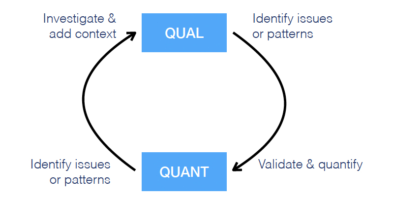
There are lots of other ways to combine qualitative and quantitative data. The combinations are endless, you can start with qualitative research and identify user needs through user interviews or you can spot different patterns and very large sets of data or you can start with the usability test. It also depends on time, budget and resources available.