First published at https://nivleshc.wordpress.com
Introduction
Recently, I had a requirement for a tool to visualise some data I had collected. My requirements were very simple. I didn’t want something that would cost me a lot, and at the same time I wanted the reports to be elegant and informative. Most of all, I didn’t want to have to go through pages and pages of documentation to learn how to use it.
As my data was within Amazon Web Services (AWS), I thought to check if AWS had any such offerings. Guess what, there was indeed a tool just for what I wanted, and after using it, I was amazed at how simple and elegant it is.
In this blog, I will show how you can easily get started with Amazon QuickSight. I will take you through the steps to import your data into Amazon QuickSight and then create some informative visualisations.
Some background on Amazon QuickSight
Pricing
Amazon QuickSight is very inexpensive, infact, if your data is not too much, you won’t have to pay anything!
For standard edition use, Amazon QuickSight provides 1GB of SPICE for the first user free per month. SPICE is an acronym for Super-fast, Parallel, In-memory, Calculation Engine and it uses a combination of columnar storage, in-memory technologies enabled through the latest hardware innovations, machine code generation, and data compression to allow users to run interactive queries on large datasets and get rapid responses. SPICE is the calculation engine that Amazon QuickSight uses.
Any additional SPICE is priced at $USD0.25 per GB/month. For the latest pricing, please refer to https://aws.amazon.com/quicksight/#Pricing
Data Sources
Currently Amazon QuickSight supports the following data sources
- Relational Data Sources
- Amazon Athena
- Amazon Aurora
- Amazon Redshift
- Amazon Redshift Spectrum
- Amazon S3
- Amazon S3 Analytics
- Apache Spark 2.0 or later
- Microsoft SQL Server 2012 or later
- MySQL 5.1 or later
- PostgreSQL 9.3.1 or later
- Presto 0.167 or later
- Snowflake
- Teradata 14.0 or later
- File Data Sources
- CSV/TSV – (comma separated, tab separated value text files)
- ELF/CLF – Extended and common log format files
- JSON – Flat or semi-structured data files
- XLSX – Microsoft Excel files
Unfortunately, currently Amazon DynamoDB is not supported as a native data source. Since my data is in Amazon DynamoDB, I had to write some custom lambda functions to export it to a csv file, so that it could be imported into Amazon QuickSight.
Ok, time for that walk-through I promised earlier. For this blog, I will be using an S3 bucket as my data source. It will contain the CSV files that I will use for analysis in Amazon QuickSight.
Step 1 – Create S3 buckets
If you haven’t already done so, create an S3 bucket that will contain the csv files. The S3 bucket does not have to be publicly accessible. Once created, upload the csv files into the S3 bucket.
In my case, the csv file is called orders.csv and its location is https://s3.amazonaws.com/sample/orders.csv (to get the URL to your S3 file, login to the S3 console and navigate to the S3 bucket that contains the file. Click the S3 bucket to open it, then click the file name to open its properties. Under Overview you will see Link. This is the URL to the file)
Step 2 – Create an Amazon QuickSight Account
Before you start using Amazon QuickSight, you must create an account. Unfortunately, I couldn’t find a way for creating an Amazon QuickSight account without creating an Amazon AWS account. If you don’t have an existing Amazon AWS account, you can create an AWS Free Tier account. Once you have got an AWS account, go ahead and create an Amazon QuickSight account at https://aws.amazon.com/quicksight/.
While creating your Amazon QuickSight account, you will be asked if you would like Amazon QuickSight to auto-discover your Amazon S3 buckets. Enable this and then click to Choose S3 buckets. Choose the S3 bucket that you created in Step 1 above. This will give Amazon QuickSight read-only access to the S3 bucket, so that it can read the data for analysis.
Step 3 – Create a manifest file
A manifest file is a JSON file that provides the location and format of the data files to Amazon QuickSight. This is required when creating a data set for S3 data sources. Please refer to https://docs.aws.amazon.com/quicksight/latest/user/supported-manifest-file-format.html if you would like more information about manifest files.
Below is my manifest file, which I have affectionately named ordersmanifest.json.
{
   "fileLocations": [
      {
         "URIs": [
            "https://s3.amazonaws.com/sample/orders.csv"
         ]
      },
   ],
   "globalUploadSettings": {
      "format": "CSV",
      "delimiter": ",",
      "textqualifier": "'",
      "containsHeader": "true"
   }
}
Once created, upload the manifest file into the same S3 bucket as to where the csv file is stored.
Step 4 – Create a data set
- Login to your Amazon QuickSight account. From the top right, click on Manage data
- In the next screen, click on New data set
- In the next screen, for Create a Data Set FROM NEW DATA SOURCES, click on S3
- In the next screen
- provide a name for the data source
- for Upload a manifest file ensure URL is clicked and enter the URL to the manifest file (you can get the url by logging into the S3 console, and then clicking on the manifest file to reveal its properties. Under the Overview tab, you will see Link. This is the URL to the manifest file).
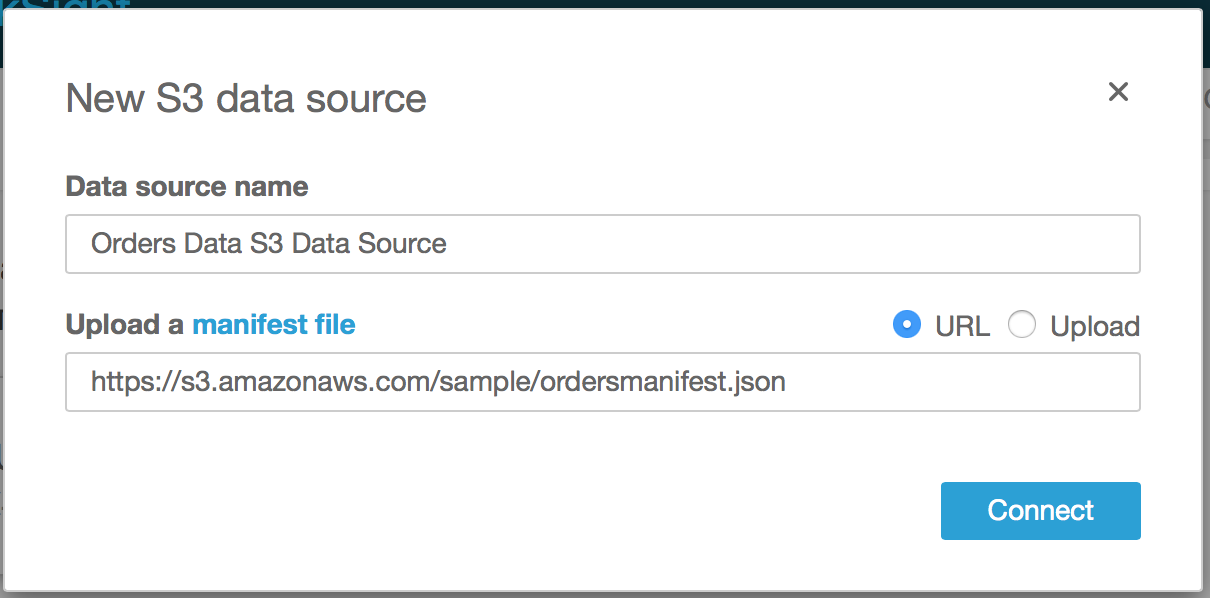
- Click Connect
- Amazon QuickSight will now read the manifest file and then import the csv file to SPICE. You will see the following screen
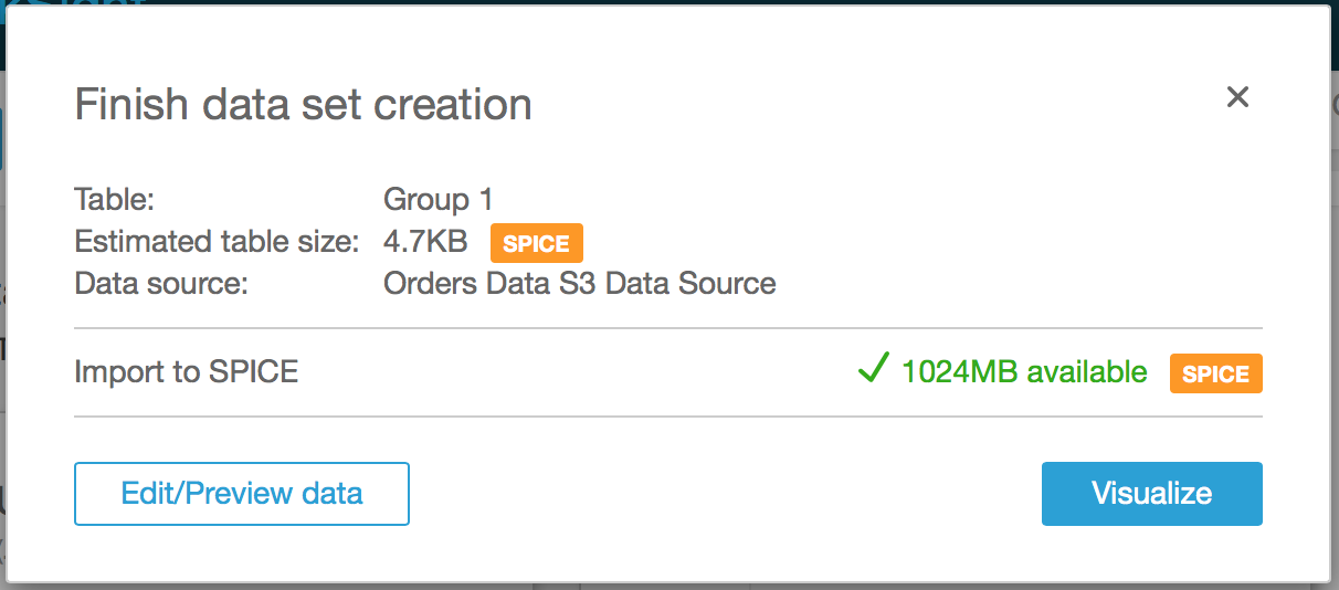
- Click on Edit/Preview data.
- In the next screen, you will see the contents of the data file that was imported, along with the Fields name on the left. If you want to exclude any columns from the analysis, simply untick them (I unticked orderTime (S) since I didn’t need it)
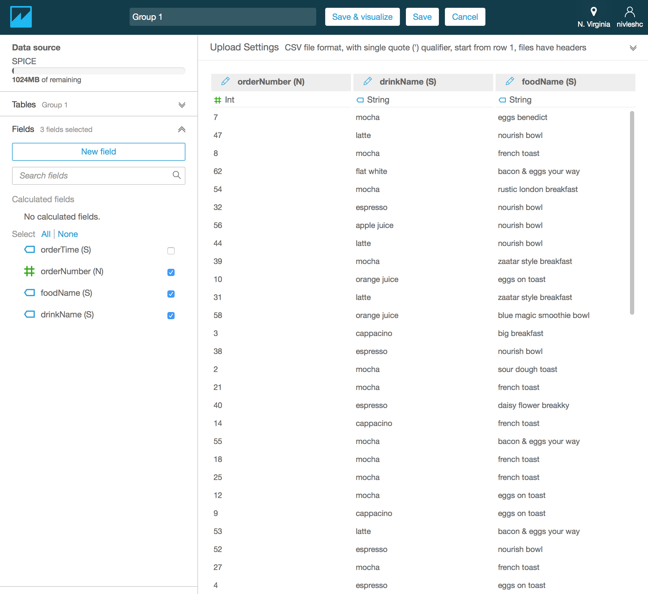
- By default, the data is called Group 1. To customise the name, replace Group 1 with a text of your choice (I have renamed my data to Orders Data)
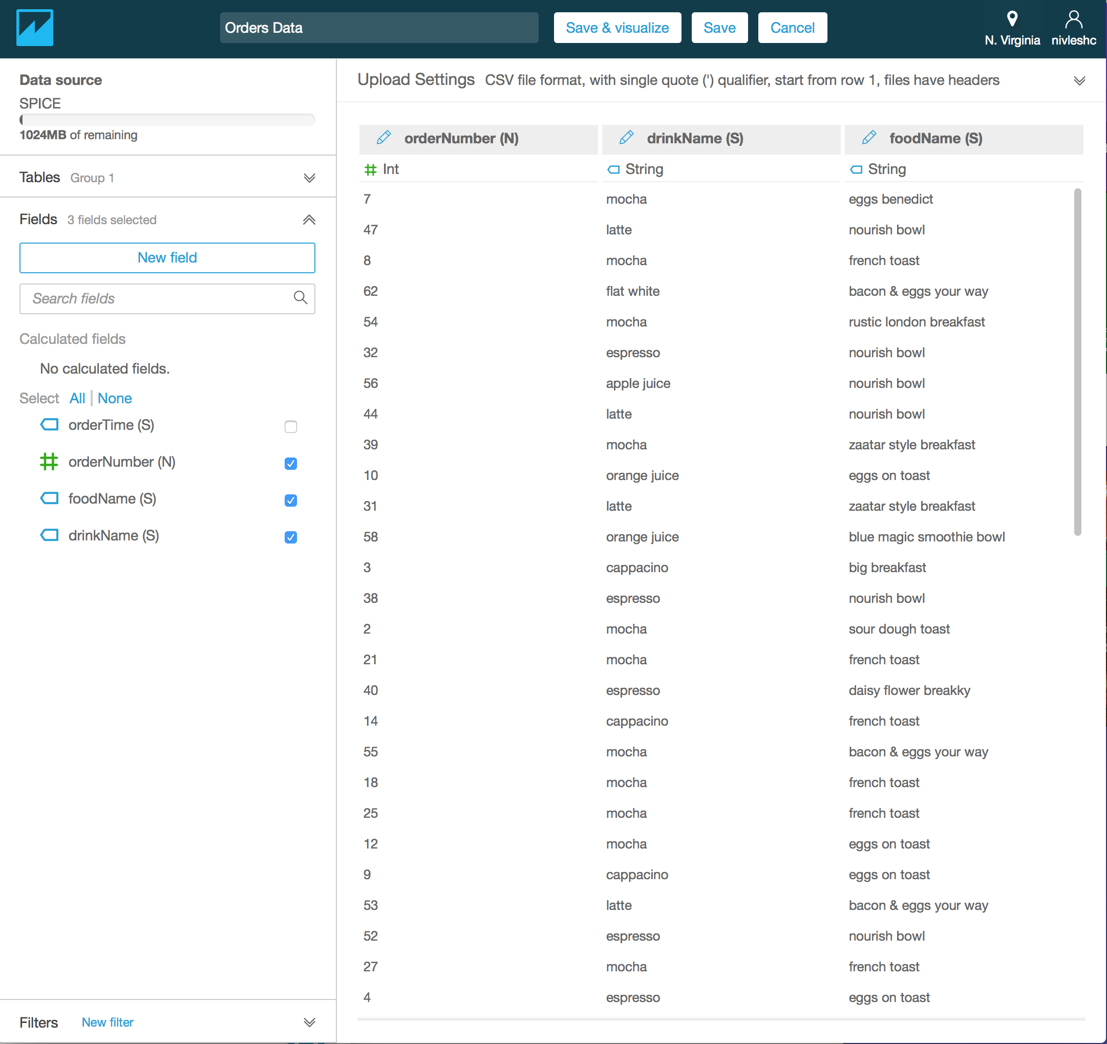
- Click Save & visualize from the top menu
Step 5 – Create Visualisations
Now that you have imported the data into SPICE, you can start analysing it and creating visualisations.
After step 4, you should be in the Analysis section.
- Depending on which visualisation you want, you can select the respective type under Visual types from the bottom left hand side of the screen. For my visualisations, I chose Pie Chart (side note – you will notice that orderTime (S) isn’t listed under Fields list. This is because we had unticked it in the previous screen)
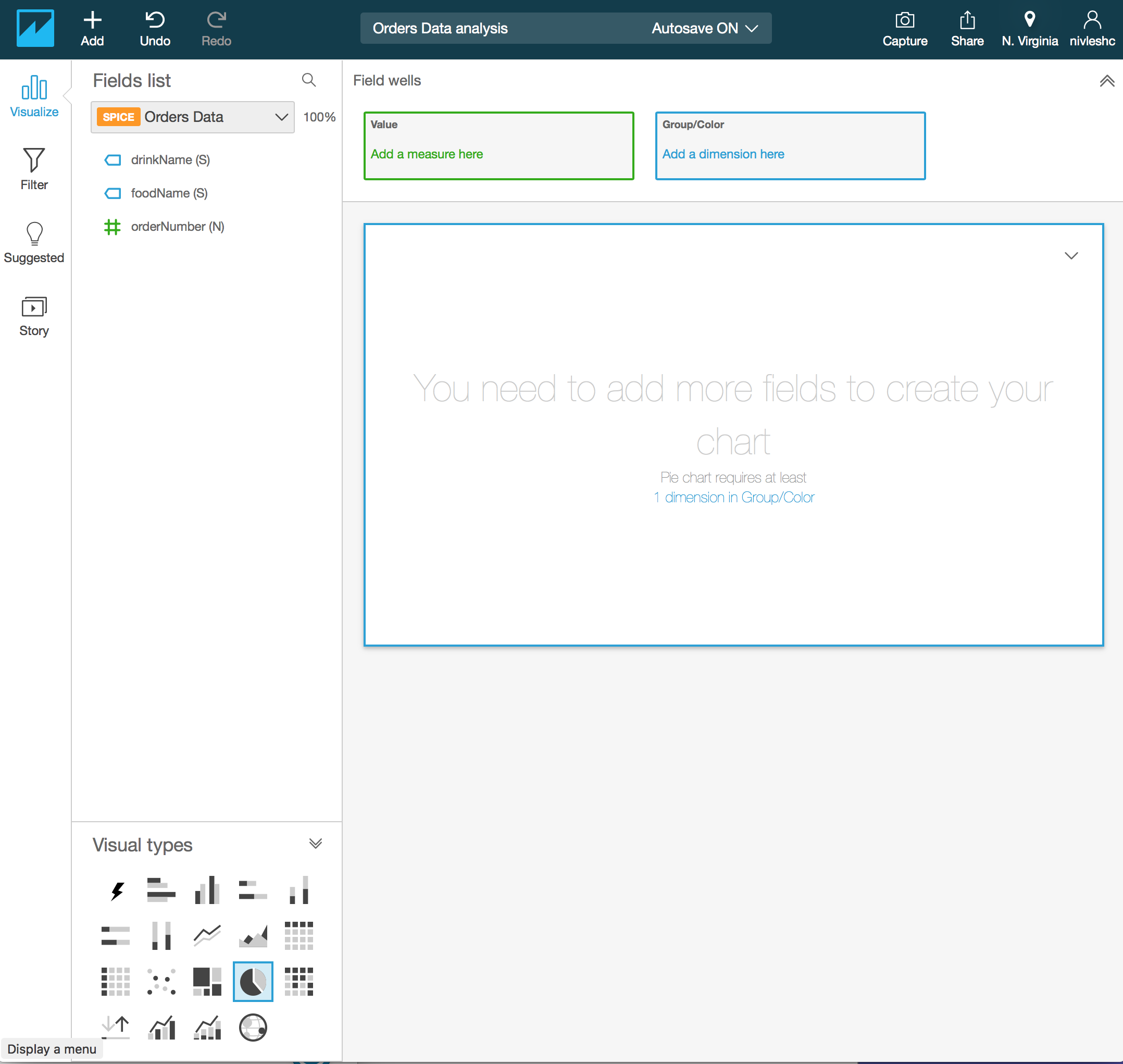
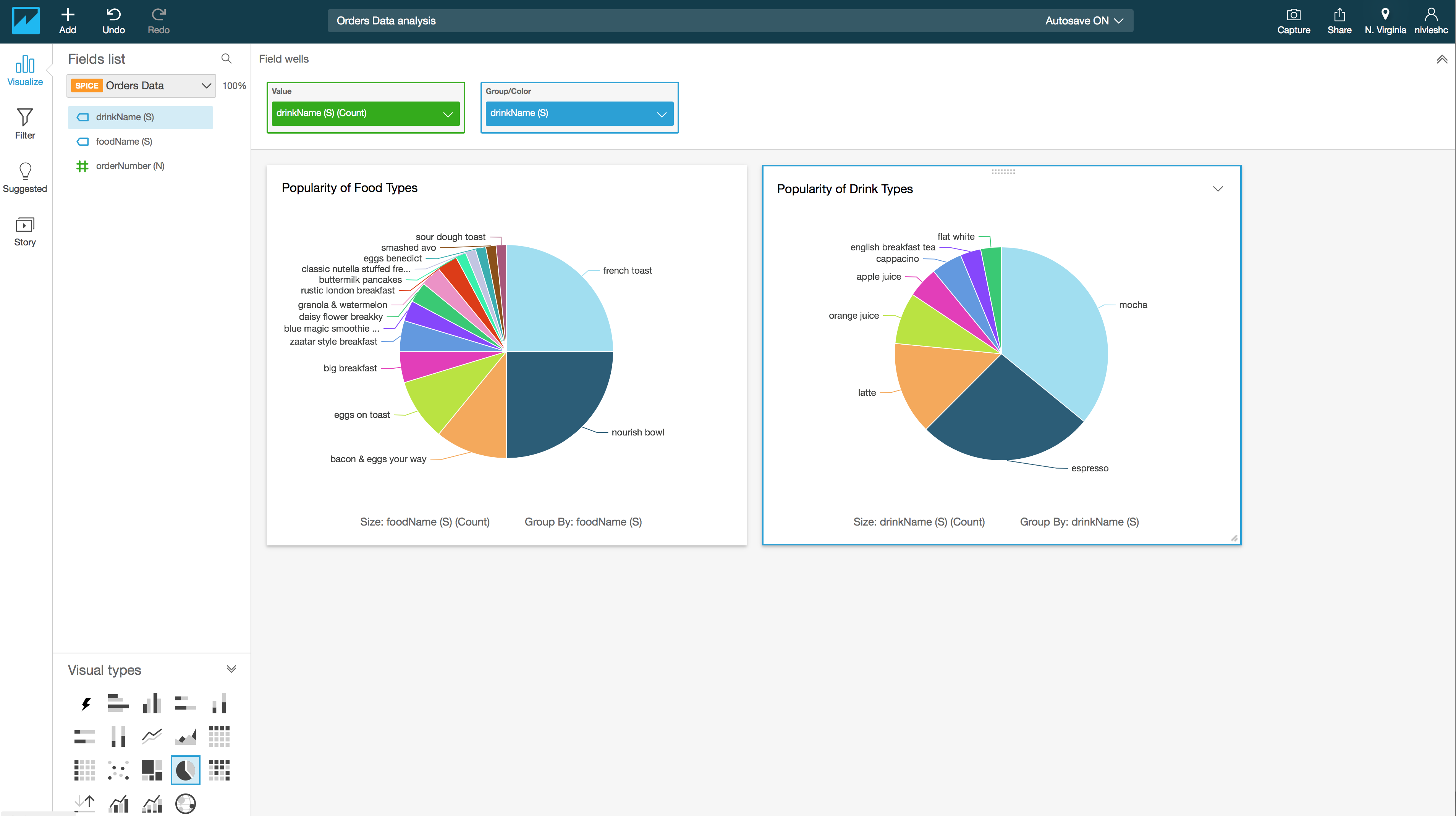
- I want to create two Pie Charts, one to show me analysis about what is the most popular foodName and another to find out what is the most popular drinkName. For the first Pie Chart, drag foodName (S) from the Fields list to the Value – Add a measure here box in the top of the screen. Then drag foodName (S) from the Fields list to the Group/Color – Add a dimension here box in the top of the screen. You will see the following
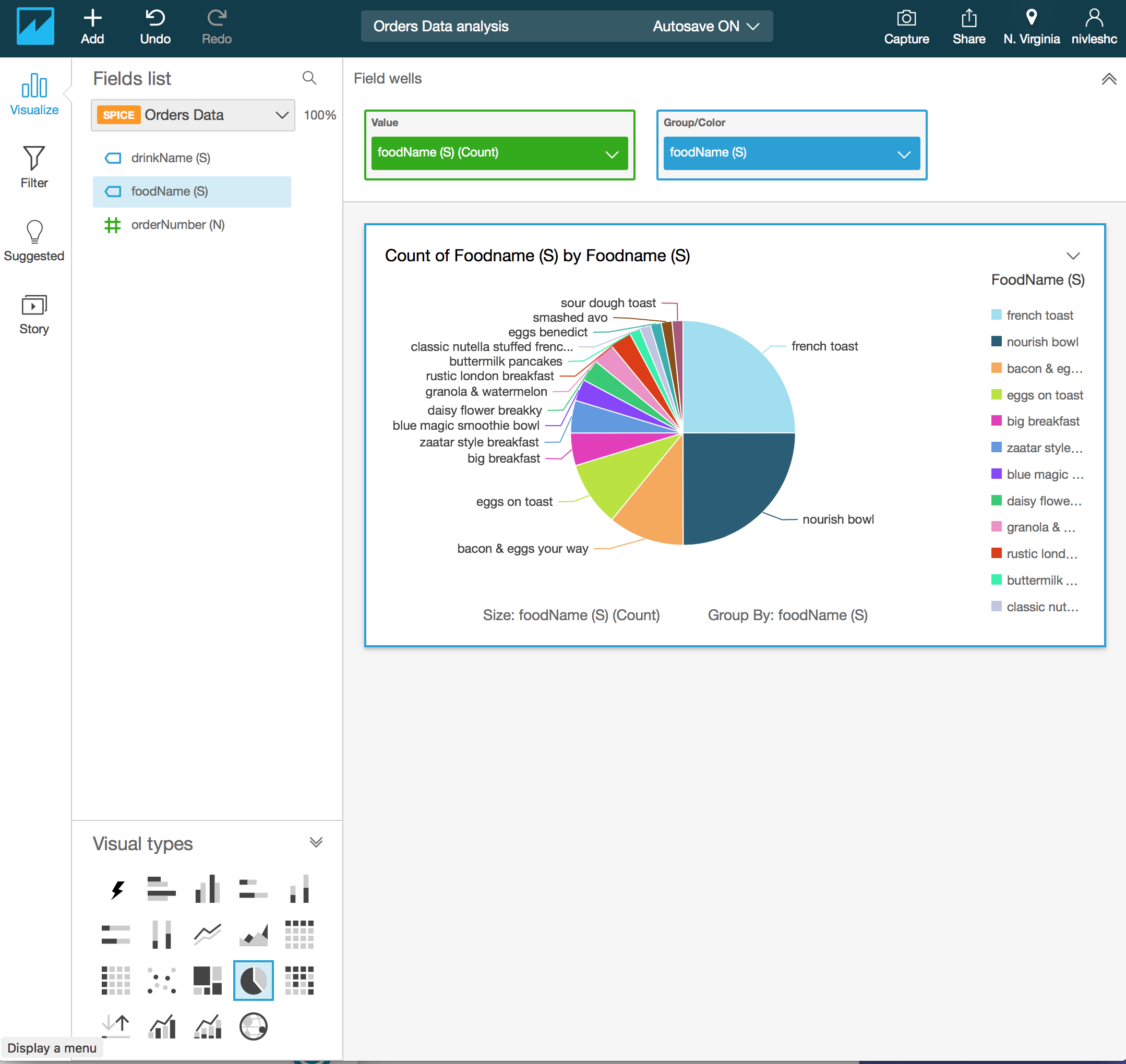
- You can customise the visualisation title Count of Foodname (S) by Foodname (S) by clicking it and then changing the text (I have changed the title to Popularity of Food Types)
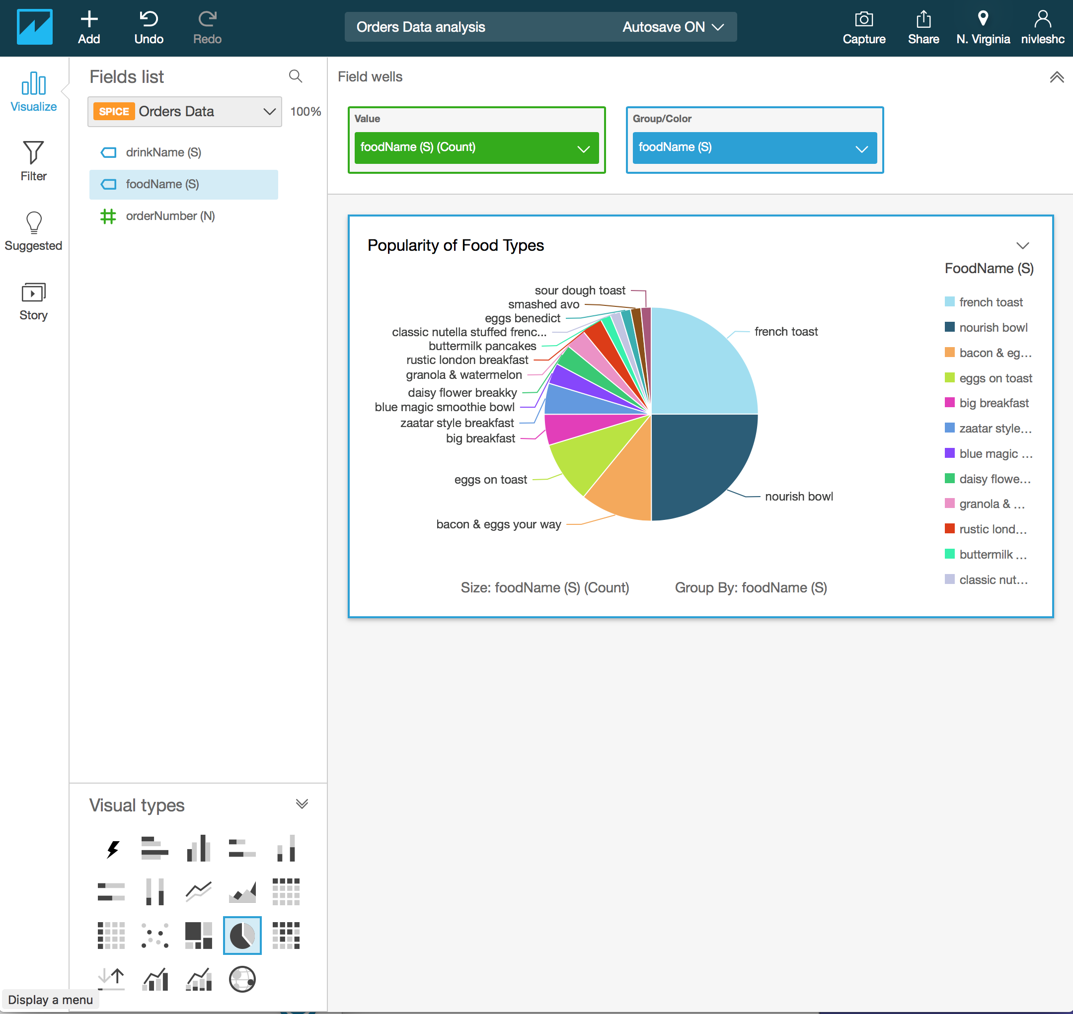
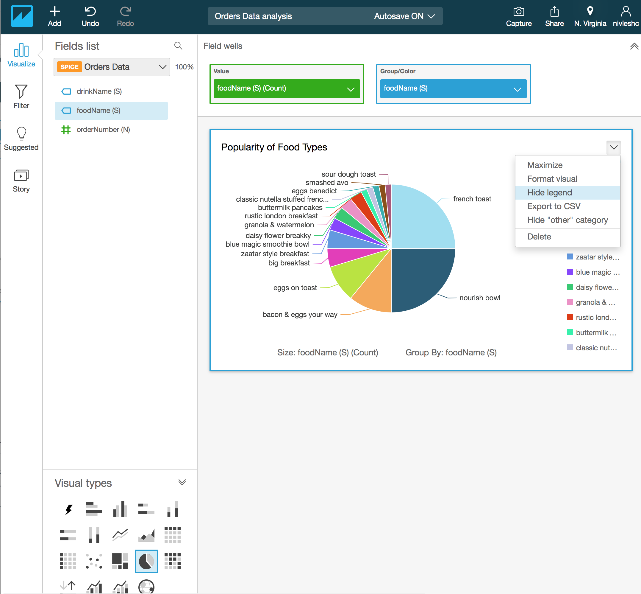
- If you look closely, the legend on the right hand side doesn’t serve much purpose since the pie slices are already labelled quite well. You can also get rid of the legend and get more space for your visual. To do this, click on the down arrow above FoodName (S) on the right and then select Hide legend
- Next, lets create a Pie Chart visualisation for drinkName. From the top menu, click on Add and then Add visual
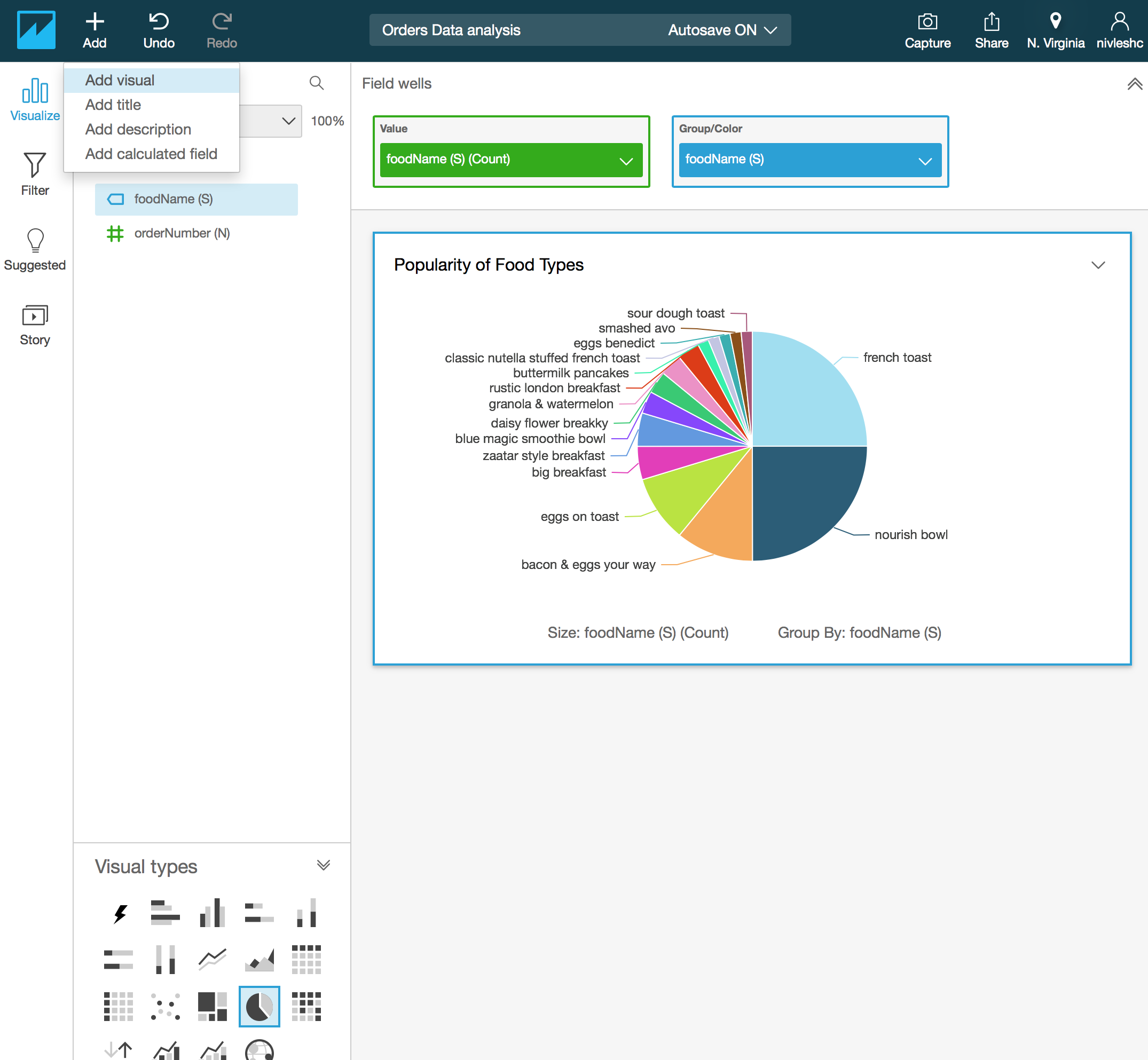
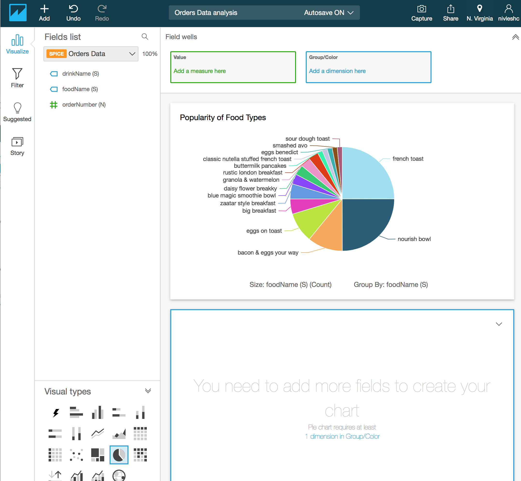
- You will now have another Canvas at the bottom of the first Pie Chart. Click this new canvas area to select it (a blue border will appear to show that it is selected). From Visual types at the bottom left hand side, click on the Pie Chart visual. Then from the top, click on Field wells to expose the Value and Group/Color boxes for the second canvas
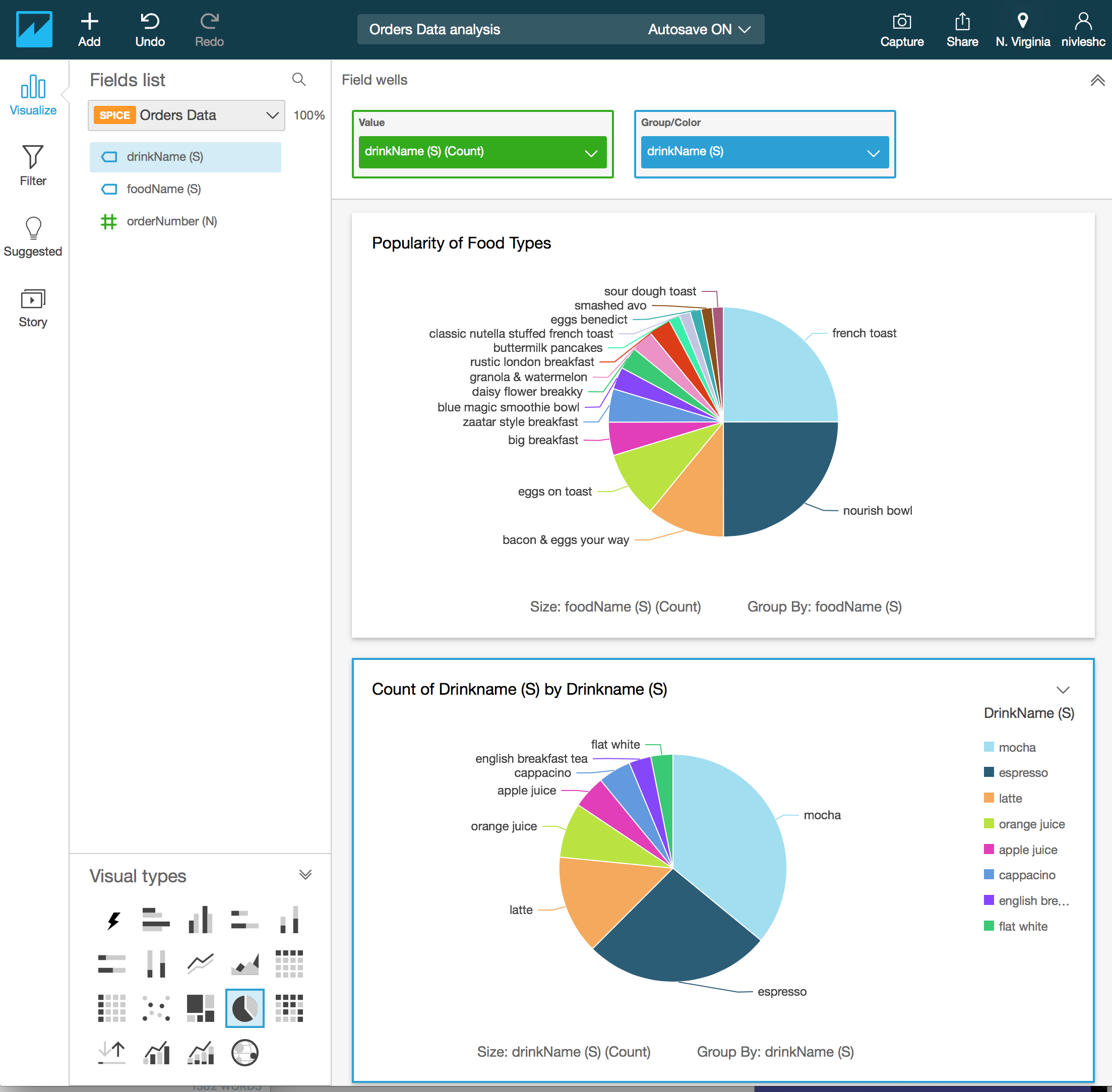
- From the Field list on the left, drag drinkName (S) to the Value – Add a measure here box in the top of the screen. Then drag drinkName (S) from the Fields list to the Group/Color – Add a dimension here box in the top of the screen. You will now see the following
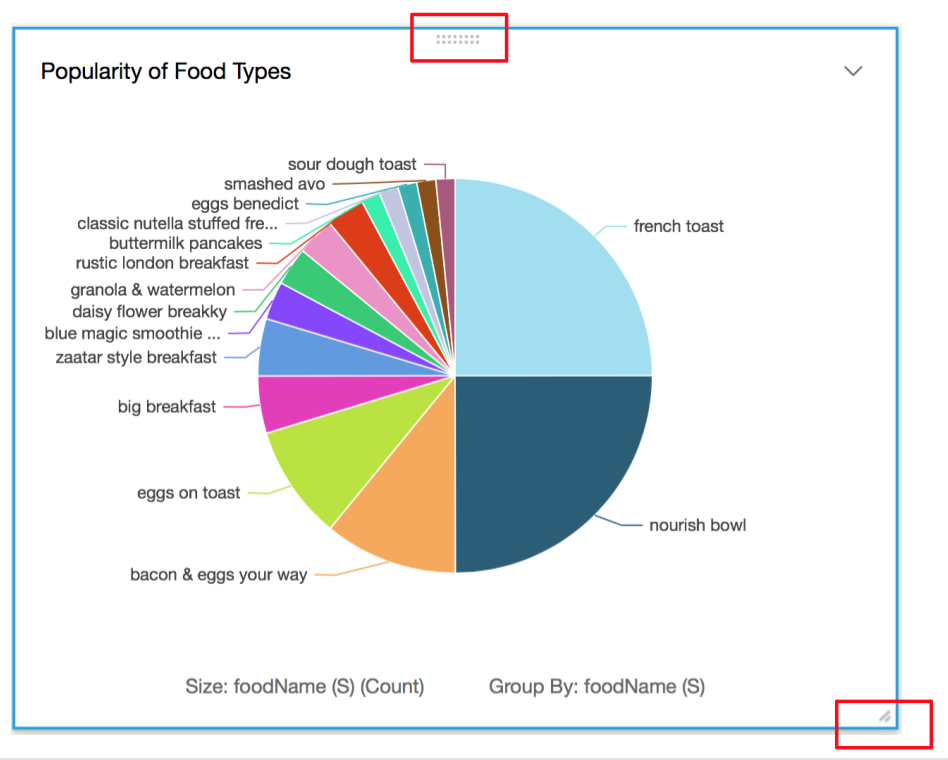
- We are almost done. I actually want the two Pie Charts to sit side by side, instead of one ontop ofthe other. To do this, I will show you a neat trick. In each of the visuals, at the bottom right border, you will see two diagonal lines. If you move your mouse pointer over them, they change to a resizing cursor. Use this to resize the visual’s canvas area. Also, in the middle of the top border of the visual, you will see two rows of gray dots. Click your mouse pointer on this and drag to the location you want to move the visual to.
- I have hidden the legend for the second visual, customised the title and resized both the visuals and moved them side by side. Viola! Below is what I get. Not bad aye!
Step 6 – Create a dashboard
Now that the visuals have been created, they can be shared it with others. This can be done by creating a dashboard. A dashboard is a read-only snapshot of the analysis. When you share the dashboard with others, they can view and filter the dashboard data, however any filters applied to the dashboard visual exist only when the user is viewing the dashboard, and aren’t saved once it is closed.
One thing to note about sharing dashboards – you can only share dashboards with users who have an Amazon QuickSight account.
Creating a dashboard is very easy.
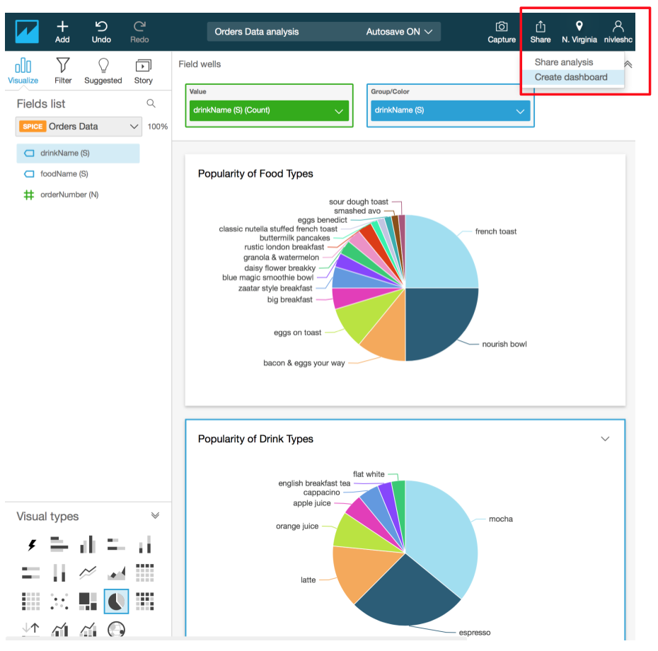
- In the Analysis screen, on the top right corner, click on Share and then select Create dashboard
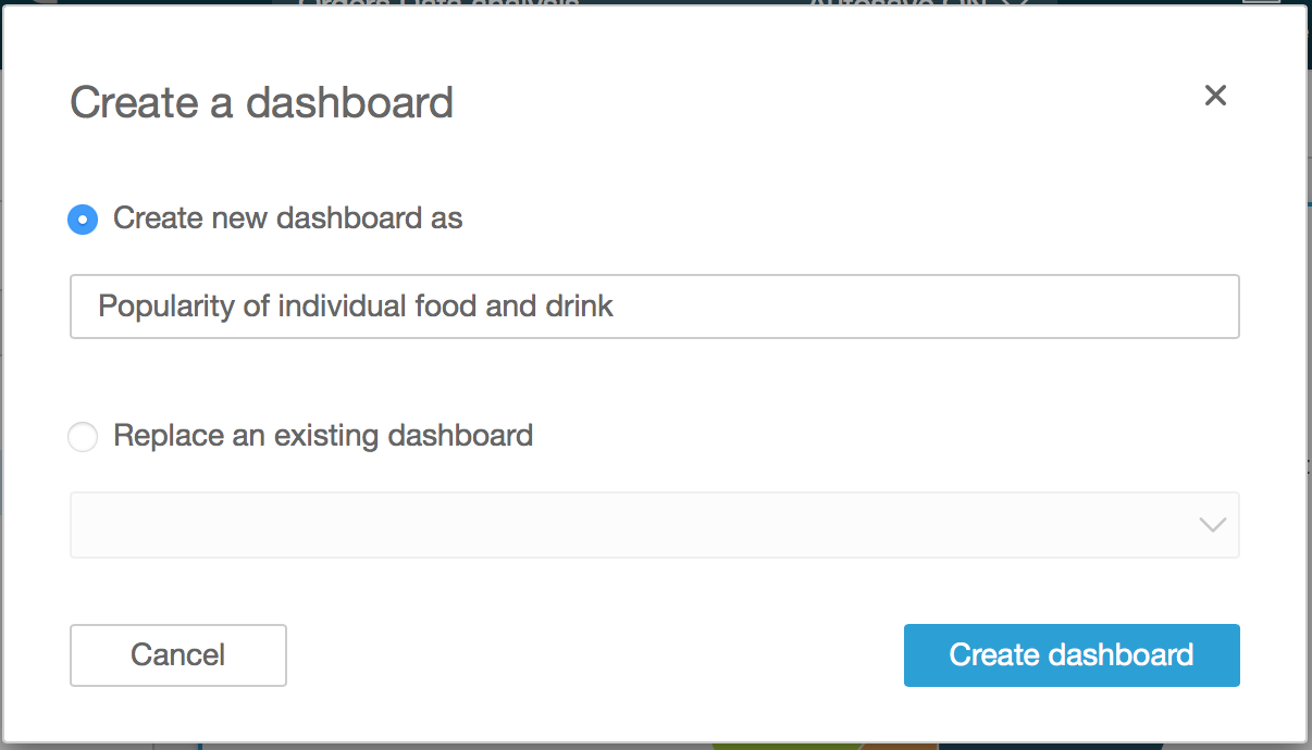
- You can either replace an existing dashboard or create a new one. In our case, since we are creating a new dashboard, select Create a new dashboard as and enter a name for the dashboard. Once finished, click Create dashboard
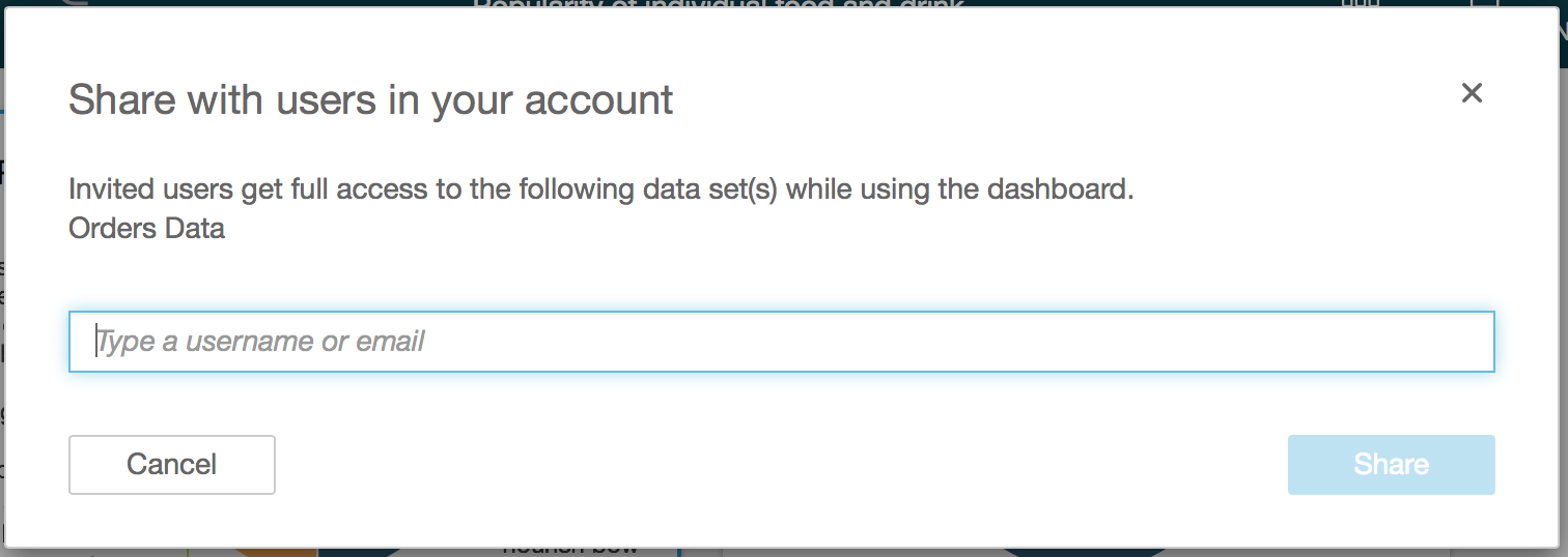
- You will then be asked to enter the username or email address of those you want to share the dashboard with. Enter this and click on Share
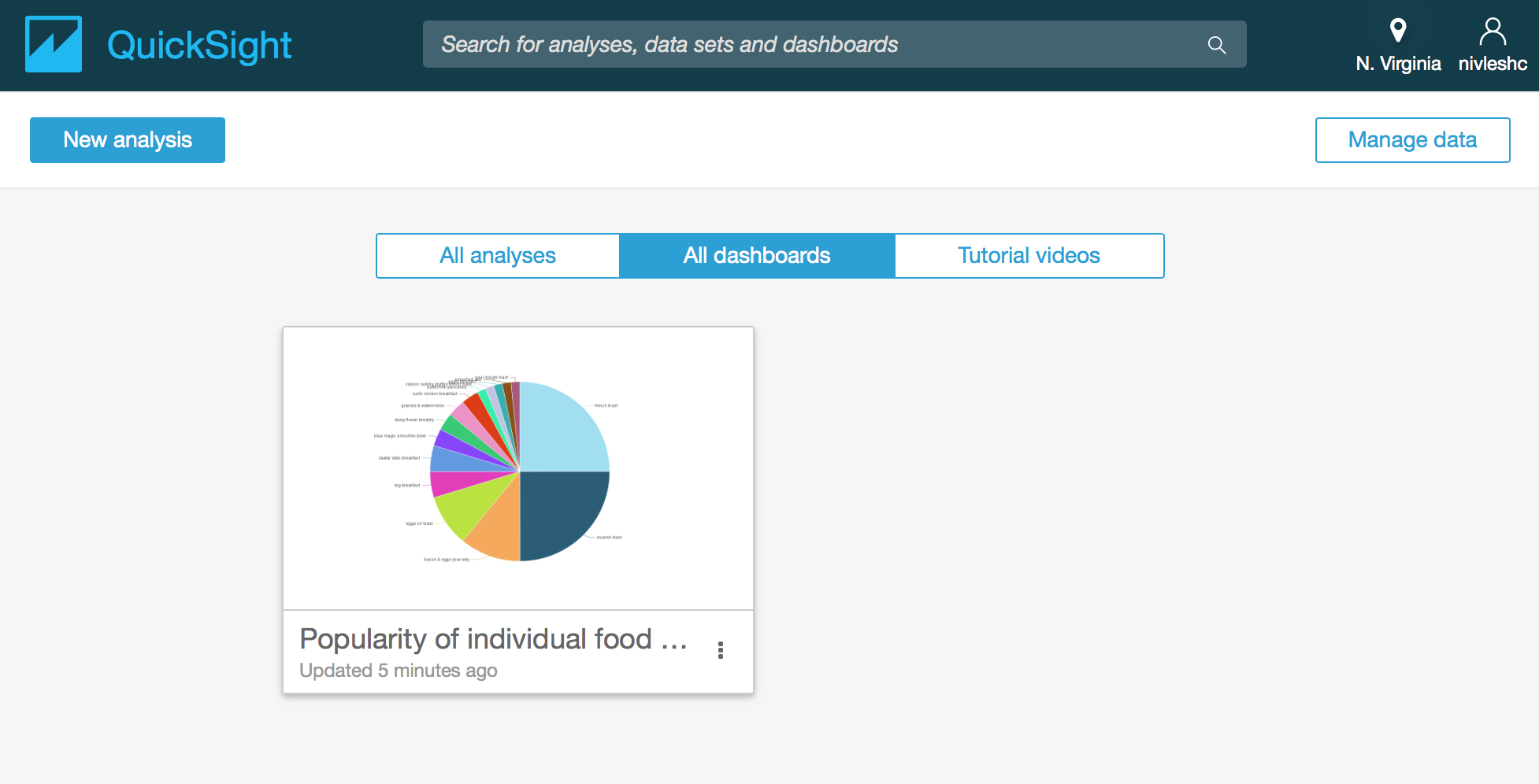
- That’s it, your dashboard is now created. To access it, go to the Amazon QuickSight home screen (click on the Amazon QuickSight icon on the top left hand side of the screen) and then click on All dashboards. Those that you have shared the dashboard with will also be able to see it once they login to their Amazon QuickSight account.
Step 6 – Refreshing the Data Set
If your data set continually changes, your visualisations/dashboards will not show the updated information. This can be done by refreshing the data set. Doing this will import the new data into SPICE, which will then automatically update the analysis/visualisations and dashboards
Note: you will have to manually reload the webpage to see the updated visualisations and dashboard
There are two ways of refreshing data sets. One is to do it manually while the other is to use a schedule. The scheduled data refresh allows for the data to be automatically refreshed at a certain time daily, weekly or monthly. A maximum of five scheduled refreshes can be configured.
The steps below show how you can manually refresh the data or create schedules to refresh the data
- From the Amazon QuickSight main screen, click on Manage data from the top left of the screen
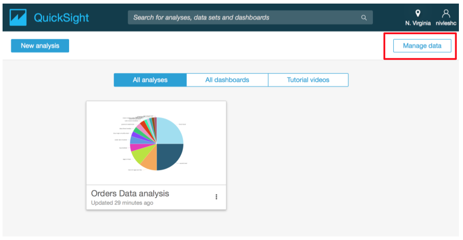
- In the next screen, you will see all your currently configured data sets. Click the Orders Data dataset (this is the one we had created previously).
- In the next screen, you will see Refresh Now and Schedule refresh
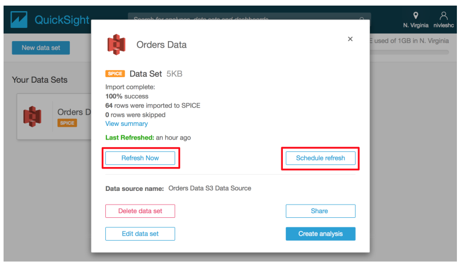
- Clicking on Refresh Now will manually refresh the data. Clicking on Schedule refresh will bring up the screen where you can configure a schedule for refreshing the data automatically.
That’s it folks! Wasn’t that simple? If you already have an Amazon AWS account, I would strongly recommend giving Amazon QuickSight a try for all your analytics needs. Even if you don’t have an Amazon AWS account, I would still suggest getting an AWS free tier account to try it out.
Enjoy 😉
