So in the last blog I looked at one of the Business Intelligence tools available in the Microsoft stack by using the Power Query M language to query data from an Internet source and present in Excel. Microsoft are making a big push into the BI space at the moment, and for good reason. BI is a great cloud workload. So now let’s take a look at one of the heavy hitters at the other end of the BI scale spectrum, Azure Machine Learning.
The list of services available in Azure is growing fast. In fact, it used to be that you could see them all on one page in the Azure Portal, but now I have 28 different icons to choose from. Many of these are traditional cloud infrastructure services like Virtual Machines, Networks and SQL databases but there are now many higher level services where the infrastructure under the hood has long since been forgotten. While bigger virtual machines and faster disks get plenty of publicity because they are easy to understand and compare between cloud vendors, it is the higher level services that are much more interesting, after all, this is what Cloud is all about, not cheaper virtual machines but services that solve business problems.
Azure Stream Analytics, Azure Machine Learning and Azure Search have all been added recently to the Azure platform and fall into the category of “don’t bother me with annoying infrastructure just answer this problem”. Recently the Microsoft Research team had an Internet sensation when they released How-Old.net which uses a trained machine learning model to guess how old the faces in an uploaded photo are. The simplicity of the problem and the user interface belie the huge amount of human knowledge and compute power that is brought together to solve it which is available to you and me today.
So what’s that science fiction sounding “Machine Learning” all about?

Machine Learning
Machine Learning is a data modelling environment where the tools and algorithms for data modelling are presented in an environment that can be used to test and retest a hypothesis and then use that model to make predications. Which all sounds a bit 1st year Uni Stats lecture, and it is. In browsing around the many samples for Azure Machine Learning most demonstrate how easy it is to use the tools but with very little depth or understanding and without the end to end approach from a problem to an answer. So let’s fix that.
There’s plenty of good background reading on machine learning but a good take away is to follow a well-defined method:
- Business Understanding
- Data Understanding
- Data Preparation
- Modelling
- Evaluation
- Refinement
- Deployment
Business Understanding
So we need to find a problem to solve. There’s a lot of problems out there to solve, and if you want to pick one Kaggle is a great place to start. Kaggle has a number of tutorials, competitions and even commercial prize based problems that you can solve. We are going to pick the Kaggle tutorial Titanic survivors.
The business of dying on the Titanic was not a random, indiscriminate one. There was a selection process at play as there were not enough lifeboats for people and survival in the water of the North Atlantic very difficult. The process of getting into a life boat during the panic would have included a mixture of position (where you are on the boat), women and children first, families together and maybe some other class or seniority (or bribing) type effect.
Data Understanding
The data has been split into two parts, a train.csv data set which includes the data on who survived and who didn’t and a test.csv which you use to guess who died and who didn’t. So let’s first take a look at the data in Excel to get a better understanding. The data set of the passengers have the following attributes.
| survival | Survival (0 = No; 1 = Yes) |
| pclass | Passenger Class (1 = 1st; 2 = 2nd; 3 = 3rd) |
| name | Name |
| sex | Sex |
| age | Age |
| sibsp | Number of Siblings/Spouses Aboard |
| parch | Number of Parents/Children Aboard |
| ticket | Ticket Number |
| fare | Passenger Fare |
| cabin | Cabin |
| embarked | Port of Embarkation (C = Cherbourg; Q = Queenstown; S = Southampton) |
First let’s take a look at the data in Excel. A quick scan shows there are 891 passengers represented in this training set (there will be more in the test set also) that the data is not fully populated, in fact the Cabin data is limited and Age has some holes in it. Also the columns PassengerId, Name, Ticket have “high cardinality”; that is there are many categories so they don’t form a useful way to categorise or group the data.
Now create a Pivot table and use Average of Survived as a Value in the Pivot table. With no other dinemsions we can see that 38% of the passengers survived. Now we can test some of the attributes and see if they have an effect on survival rate. This process is just to help understand if there is an interesting problem here to be solved and to test some of the assumptions about how lifeboats may have been filled.
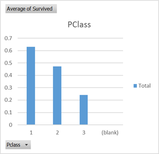
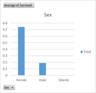
There certainly seems to be some biases at play that are not random which can lift your survival rate as a passenger from the average 0.38 probablility. So let’s see what Azure Machine Learning can come up with.
Data Preparation
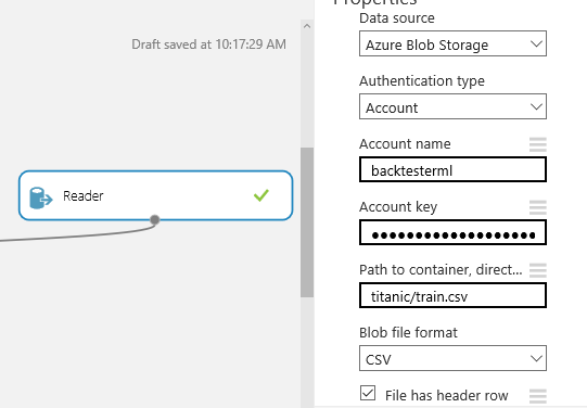
Create a new Azure Machine Learning environment if you don’t already have one. This will create a matching Azure Storage account; mine is called backtesterml.
Now upload the training data into the Azure Blob storage in a container called “titanic”. I use the AzCopy tool from the Azure Storage Tools download.
C:\Program Files (x86)\Microsoft SDKs\Azure>AzCopy /Source:C:\Users\PeterReid\Downloads /Dest:https://backtesterml.blob.core.windows.net/titanic /DestKey:yourstoragekey /Pattern:train.csv
Create a new Blank Experiment and rename it “Titanic Survivors” and drop a Reader on the design surface and point it at the Blob file we uploaded into titanic/train.csv
Add a Metadata Editor and rename the Survived column to Target. This is an indication that the model we will build is trying to predict the target value Survived
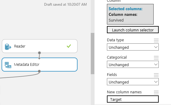
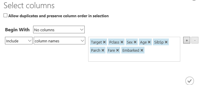
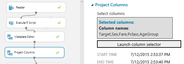
Now add a Project Columns and remove those columns that we think are not going to help with prediction or have too few values to be useful.
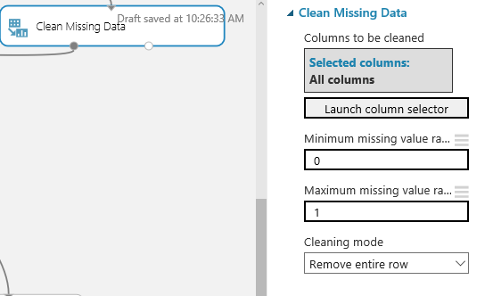
Then add a “Clean Missing Data” and set to “Remove entire row”. The Minimum and Maximum settings are set to remove all rows with any missing values rather than some other ratio.
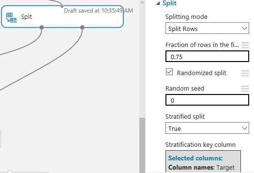
Now Split the data in two. This is important because we want to create a model that guesses survival rate and then test it against some data that was not used to generate the model. With such a small data set, how we split the data is important. I have used a “Stratified” split on the “Target” survivor column so that we get an even representation of survivors in the predication and testing data sets. Also while in here change the Random seed to something other than 0 so that on repeated runs we get the same breakup of passengers.
Modelling
Now it’s time to revisits Statistics 101 so workout what to do with this data. There are a huge number of pre-built Models that can be dropped onto the design surface choosing the right one is a little bit art and a little bit science. Here’s the science
- We have a classification problem, who survives and who doesn’t
- It is a “Two-Class” problem since you can only survive or not
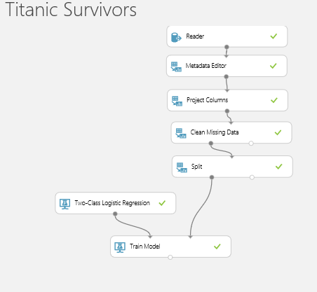
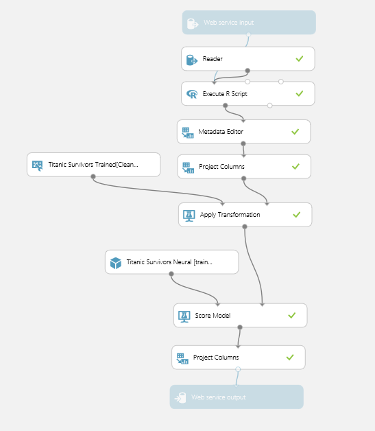
So start by opening Machine Learning->Initialize Model->Classification->”Two-Class Logistic Regression” onto the design surface. This is a binary logistic model used to predict a binary response (survival) based on one or more predictor variables (age, sex etc). Connect this to a “Train Model” with the prediction column “Target” selected and connect that to one side of a “Score Model” block. The other side of the Score Model connect up the data from the “Split” block and send the results into an “Evaluate Model”. Then hit Run!
After processing (note your using a shared service so it’s not as responsive as running something locally but is built for scale) it should look something like this:
Now one the run has completed you can click on the little ports on the bottom of the blocks to see the data and results. We are interested in the
Evaluation
Click on the output of the “Train Model” block which will bring up this window
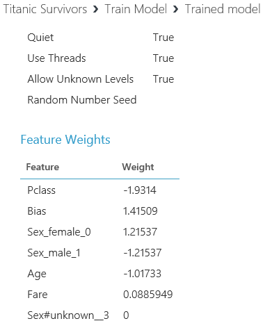
This is what the output of the regression looks like. And it means something like this:
- Having a large class value (e.g. 3rd class) has a big negative impact on survival (those on upper decks got out easier)
- Being female has a big positive impact on survival and being male has an equal negative impact (women first as we thought)
- Having a larger age has a reasonable negative impact on survival (children first as we thought)
- And having a larger ticket price has a small positive impact (rich people had some preference)
(Note Bias is an internally generated feature representing the regression fit)
OK so now we have the model built let’s see how good it is at predicting the survival rate of the other 25% of passengers we split off at the beginning.
Add and connect up a “Score Model” connect it to the right hand side of the Split block and then to the “Evaluate Model”. Then Run again
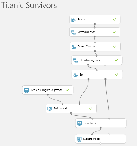
Click on the Output of the “Score Model” block to get this.
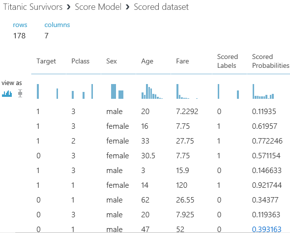
Here we have all of the remaining 25% of passengers who were not submitted to generate the model. Taking the first row, this passenger is Male, 3rd class, 20 years old and on a cheap fare given what we know about the lifeboat process he probably didn’t survive. Indeed, the model says the survival probability is only 0.119 and has assigned him a “Scored Label” of 0 which is a non-survivor. But the “Target” column says that in reality, this guy survived so the model didn’t predict correctly. The next Female was predicted properly etc, etc.
Now go to the “Evaluate Model” output. This step has looked at all the predictions vs actuals to evaluate the model’s effectiveness at prediction.
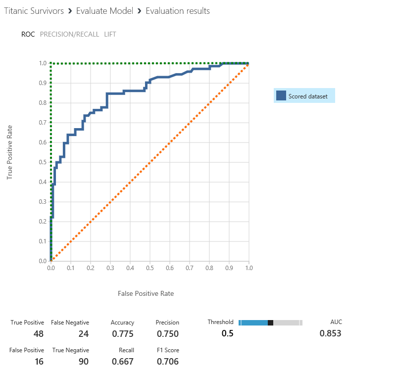
The way to read this charts is to say for every probability of survival what percentage actually survived. The best possible model is represented by the green line and a totally random pick is represented by the orange line. (You could of course have a really bad model which consistently chooses false positives which would be a line along the bottom and up the right hand side). The way to compare these models is by looking at the “Area Under the Curve” which will be somewhere between 0 (the worst) and 1 (the best). Our model is reasonably good and is given an AUC score of 0.853.
Refinement
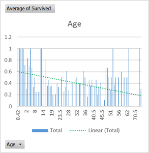
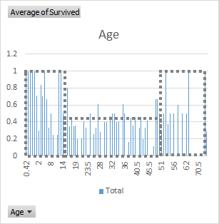
There are many ways to refine the model. When we first looked at the data there was something in that Age chart. While there certainly is a bias toward younger survivors. It’s not a linear relationship, there is a dramatic drop off at 16 and a slight increase in survival rate after 45. That fits with the expected lifeboat filling process where you would be considered as your either Young, or Old or Other.
So let’s build that into the model. To do that we will need to “Execute R-Script”. (R is a very powerful open source language and libraries built for exactly this purpose.) Drag a script editor onto the design surface, connect up the first input and enter this script:
Then connect the output to the Metadata Editor. Open up the Project Columns block and remove Age and add the new AgeGroup category. Then hit Run.
So let’s use the power of infinite cloud computing and try the brute force method first. Add all of the Two-Class regressions onto the design surface and connect them up to the Score and Evaluate blocks then Run.
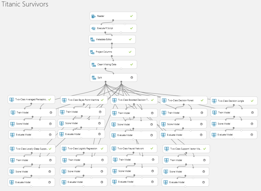
Amazingly the whole thing runs in less than 2 minutes. I have done two runs, one using Age and one using AgeGroup to see which models are sensitive to using the categorisation. What is interesting here is that despite some very different approaches to modelling the data the results are remarkably the same.
| Model | AUC Age | AUC Age Group |
| Two-Classed Locally Deep Support Vector Machine |
0.845 |
0.86 |
| Two-Classed Neural Network |
0.826 |
0.883 |
| Two-Classed Support Vector Machine |
0.871 |
0.843 |
| Two-Classed Average Perceptron |
0.864 |
0.869 |
| Two-Classed Decision Jungle |
0.844 |
0.85 |
| Two-Classed Logistic Regression |
0.861 |
0.858 |
| Two-Classed Bayes Point Machine |
0.856 |
0.85 |
| Two-Classed Boosted Decision Tree |
0.834 |
0.836 |
| Two-Classed Decision Forest |
0.827 |
0.815 |
Some of the models benefitted from the AgeGroup category and some didn’t, but the standout success is the Neural network with AgeGroup. Now it’s time to play with the Neural network parameters, iterations, nodes, parameter sweeps etc to get an optimal outcome.
Deployment
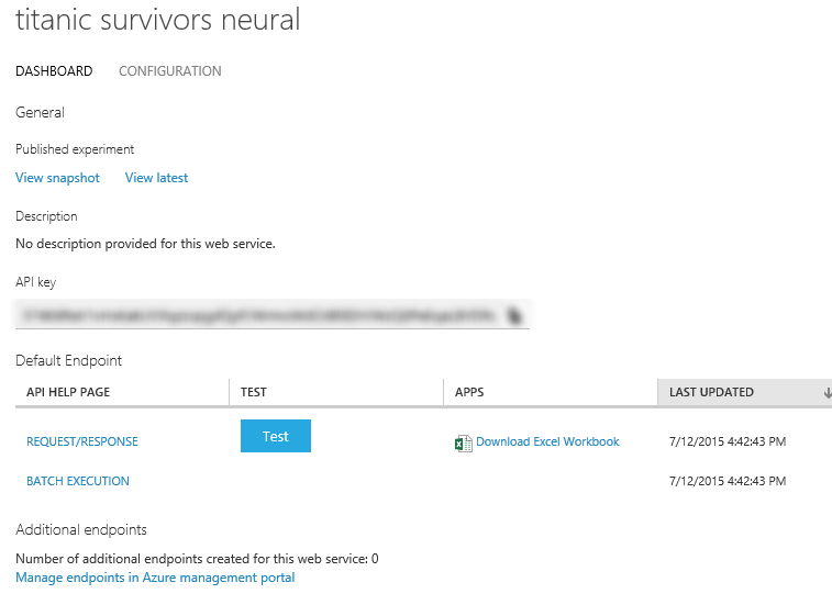
Now back to the task at hand, we started with a train.csv set of data and a test.csv data set. The aim is to determine survivors in that test.csv data set. So now “Create Scoring Experiment” and “Publish Web Service”. This will make a few modifications to your design surface including saving the “Trained Model” and plumbing it in with a web service input and output. Ive added an extra “Project Columns” so only the single column “Scored Label” is returned to indicate whether the passenger is a survivor or not. Which will look like this
Then “Publish the Web Service” which will create a web service endpoint that can be called with the input parameters of the original dataset
Now by downloading that Excel Spreadsheet and pasting in the data from the test.csv, each row generates a request to our newly created web service and populates the survival prediction value. Some of the data in the test data set has empty data for Age which we will just set to the Median age of 30 (there is significant room for improvement in the model by taking this into account properly). The beta version of the Spreadsheet doesn’t support spaces or delimiters so there is a little bit of extra data cleansing in Excel before submitting to the web service (remove quotes).
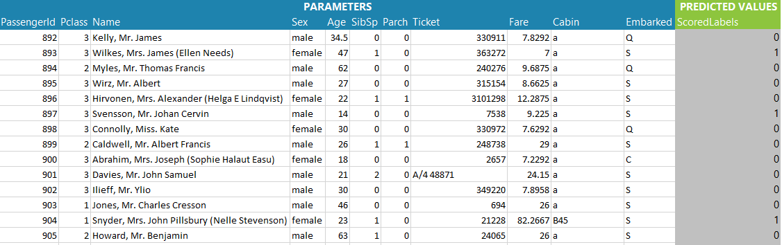
Heres the first few rows of the scored test data. Each one of these passengers were not present in the train data which stopped at passenger 891. So the “Predicted Values” is the assigned survival flag as predicted by our trained model. As a sanity check over the results the survival rate is about 27%, similar, but slightly less than the training data. Passenger 892 looks like a reasonable candidate for non survival and Passenger 893 looks like a candidate for survival.
So then prepare the data and submit to the Kaggle competition for evaluation. This model is currently sitting at position 2661 out of 17390 entries! (there are clearly a few cheaters in there with the source data available)

The process of developing this model end-to-end shows how the power of Cloud can be put to use to solve real world problems. And there are plenty of such problems. The Kaggle web site not only has fun competitions like the Titanic survivor problem, but is also a crowd sourcing site for resolving some much more difficult problems for commercial gain. Currently there is a $100K bounty if you can “Identify signs of diabetic retinopathy in eye images”.
While these sorts of problems used to be an area open to only the most well-funded institutions, Azure Machine Learning opens the opportunity to solve the world’s problems to anyone with a bit of time on a rainy Sunday afternoon!